

Your Childhood Taste Is Already Your Style
A reflection for illustrators on nostalgia, memory, and visual voice
This piece is an invitation to look at your childhood influences not as something to move on from—but as a map of the visual language you’ve been developing all along.
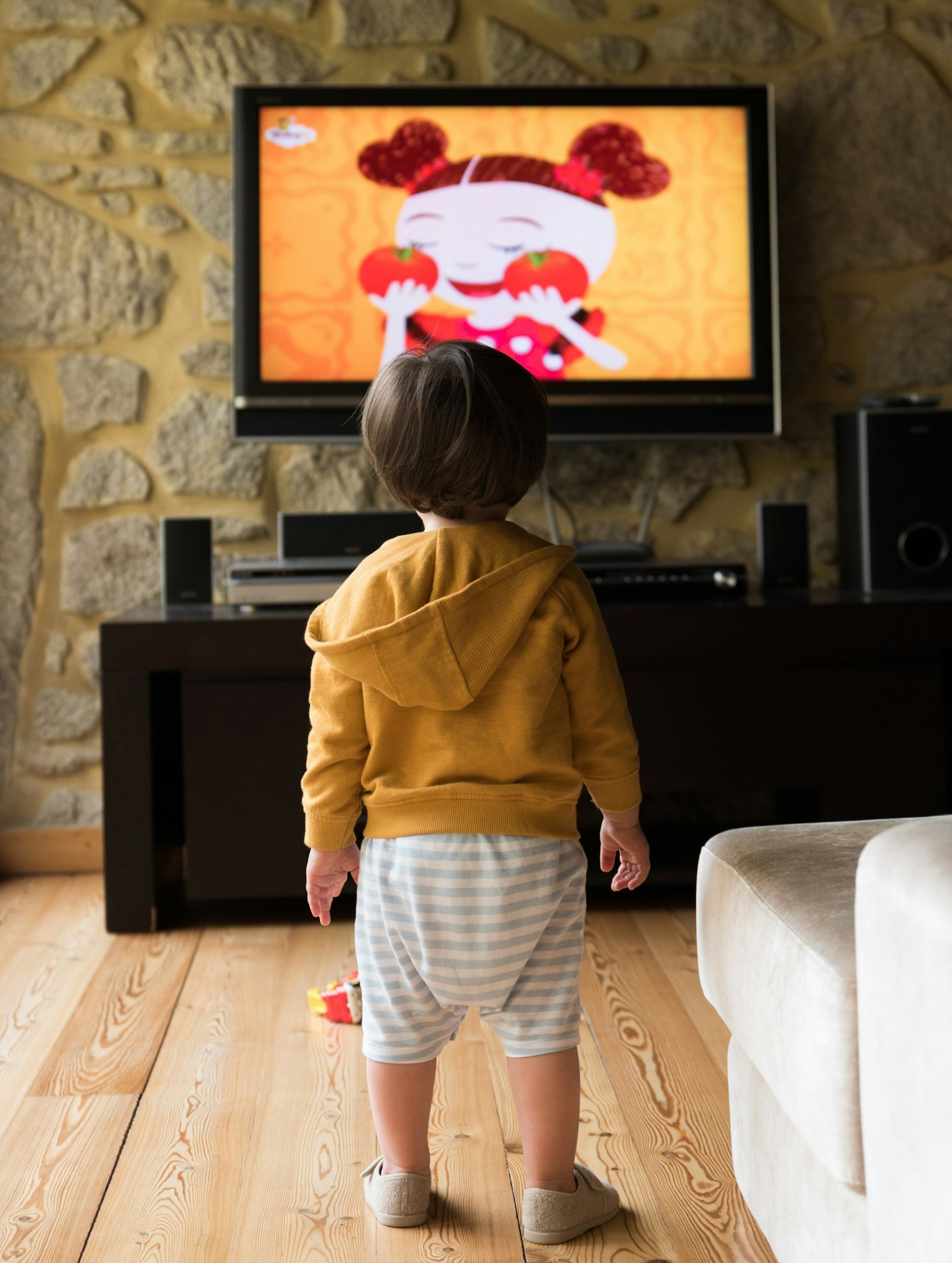
I'm not sure why but lately I have been thinking a lot about (and watching on YouTube) my favourite TV shows as a child. Perhaps I’m in need of some comfort and nostalgia, but the more I have delved into it, and the more I have been developing character drawings of my own, the more I have realised how much our artistic style is bound up subconsciously with what we consumed as children. Artists are always caught up with how to find their ‘style’ - what if it’s right under our noses?
Style Isn’t Just Visual—It’s Emotional
When we talk about illustration style, we often focus on line quality, colour palettes, or rendering techniques.
But those are surface-level outcomes.
Underneath them is something far more consistent: emotional preference.
The tone you’re drawn to.
The kind of world you want to build.
The way conflict unfolds—or is softened.
To understand your style, it helps to go back to where those instincts first formed. Ask yourself:
What did you watch repeatedly as a child?
What books did you return to again and again?
What worlds felt safe to you?
What characters felt like home?
Your answers are more than nostalgic—they’re directional. Because your early influences often reveal:
Your preferred emotional tone
Your relationship to tension and conflict
The environments you gravitate toward
Your comfort with detail, texture, and pacing
Exercise 1: Map Your Visual Instincts
Write down five childhood shows, films, or books that stayed with you. Then look at them through an illustrator’s lens.
Note any patterns in:
Settings — contained spaces, open landscapes, domestic interiors, fantastical worlds
Emotional tone — gentle, melancholic, chaotic, reassuring, whimsical
Type of problems — small interpersonal moments vs high-stakes conflict
Structure — community-driven vs lone protagonist
Reality level — grounded, surreal, symbolic
Exercise 2: Describe the Atmosphere (Not the Content)
Now, describe those same influences again—but don’t name them.
Focus only on how they feel.
You might end up with words like:
quiet, enclosed, soft, peculiar, slow, warm, slightly strange, safe
Or perhaps:
fast, intense, dramatic, expansive, high-contrast, unpredictable
This is where things click.
Because once you remove the literal references, what remains is tone—and tone is the backbone of illustration style.
If you want to take it further and you feel comfortable with it, you can use AI tools to group or cluster these words. Patterns tend to emerge quickly.
That collection of words becomes something incredibly useful: your visual vocabulary.
Your Style Is a Recombination—Not an Invention
There’s pressure, especially in illustration, to be “original.”
But originality rarely comes from creating something entirely new. It comes from combining influences in a way that only you can.
For example:
Someone (me!) who grew up on:
Cozy village life
Stop motion tactility
Structured whimsy
Community-driven narratives
Will produce very different work than someone raised on:
Action cartoons
Sci-fi dystopias
Superhero arcs
High drama
Neither approach is more valid.
They simply lead to different visual instincts—different ways of designing characters, environments, pacing, and even colour.
A Personal Example
As a child (this will reveal my age!) I grew up on: Willo the Wisp (my favourite!); Bagpuss; Postman Pat; The Adventures of Portland Bill (this is where my love of lighthouses started!); and Pigeon Street. Have delved into the above it’s probably no coincidence that my artistic instincts lean toward:
Contained worlds
Comfort over spectacle
Emotional reassurance rather than shock
Whimsy grounded in logic
Nature woven with everyday life
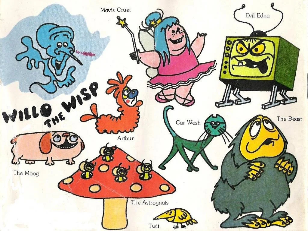
My childhood favourite - Willo the Wisp!
What really stood out to me was the overall themes of kindness, and safety. That emotional core has shaped not just how I draw, but why I draw—particularly my interest in themes like calmness, reassurance, and mental wellbeing.
For Illustrators: Stop Chasing—Start Noticing
If you’re struggling to “find your style,” it might be worth stepping away from trends, portfolios, and algorithms for a moment.
Instead, return to:
The emotional tone you naturally gravitate toward
The kinds of worlds you want to spend time in
The pace, texture, and feeling that comes intuitively to you
The stories that stayed with you before you knew what “good art” was
Because your style isn’t just how your work looks.
It’s how it feels to exist inside it.
And that feeling has likely been consistent since the very beginning.
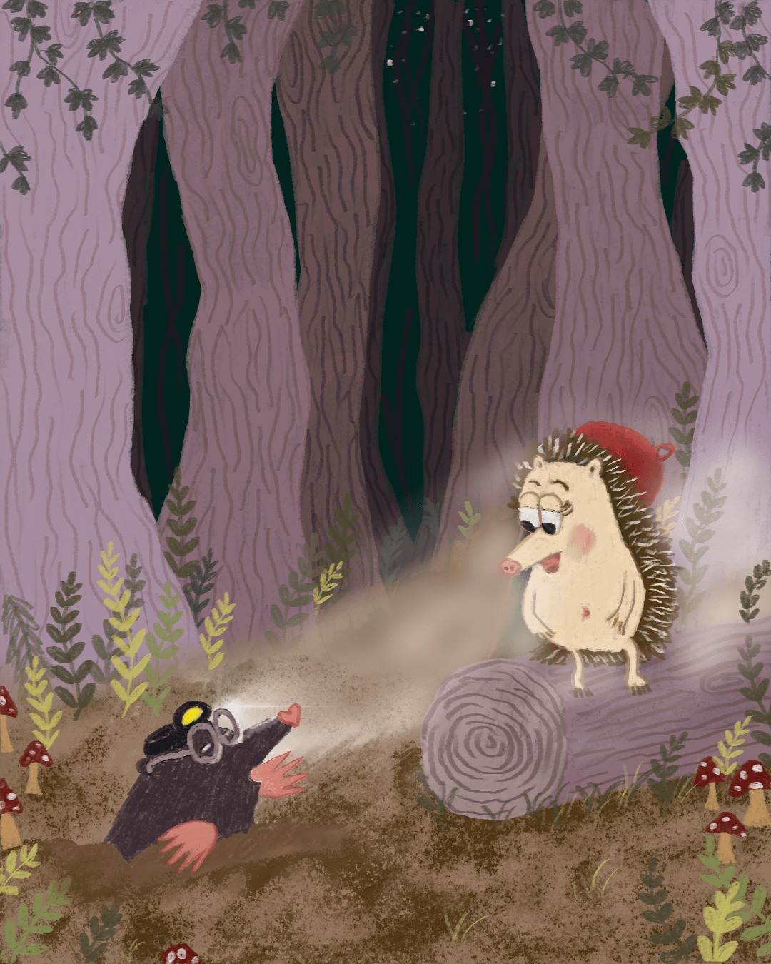
The forest background, the whimsical characters… seem familiar?
In Simple Terms
Style is emotional preference, made visible through illustration.
Not something you invent.
Something you recognise.
If you want to take this a little further, I’ve made a simple printable version of these exercises you can work through in your own time.
It’s just something I made to sit alongside this piece—nothing polished or complicated.
You can download it below if it feels useful.
If this way of thinking resonates with you, I write about illustration, process, and building a slower, more intentional creative practice.
You’re very welcome to subscribe if you’d like more of that.